Grafana and Prometheus Monitoring Essentials: Setup, Visualization, and Alerts with PromQL

Table of contents
- Grafana and PromQL
- Set Up Alerts
- Visualize the Data in Grafana
- Using Thresholds in Grafana
- Graph Styles and Standard Options
Grafana and PromQL
How to Set Up a Grafana Panel with PromQL
Create a New Dashboard
1. Click on Dashboards in the left-hand menu.
 |
| Click on Dashboards in the left-hand menu. |
2. Select "New Dashboard" and New Visualization choose prometheus as a Datasource
 |
| Select "New Dashboard" |
 |
| Select New Visualization |
 |
| Choose prometheus as a Datasource |
Add a New metric.
Once the new dashboard is created, you can add a metric1. In the metric editor, click select a metric and then Metric explorer.
 |
| Click select a metric and then Metric explorer |
2. write node_cpu_seconds_total inside search field
 |
| write node_cpu_seconds_total inside search field |
3. Select node_cpu_seconds_total
4. choose Operation, Rate function and select Rate
 |
| Operation, Rate function and select Rate |

5. select 5m within Rate range
 |
| select 5m within Rate range |
the resulted PromQL is: rate(node_cpu_seconds_total{mode="user"}[5m])
to plot the graph press: Run queries
The results of the query will be plotted in the panel.
 |
| Plot of the selected query |
Customize the Visualization
Grafana allows you to customize how your data is visualized:1. Use the "Visualization" tab to change the type of graph (Time Series, Gauge, Bar, etc.).
 |
| Time Series Visualization |
 |
| Gauge Visualization |
2. Set thresholds, axis limits, and colors to make the graph more informative.
 |
| Graph more informative |
3. Apply any necessary filters or transformations to further tailor the data display.
 |
| Apply filters or transformations |
4. Save the dashboard
 |
| Save the dashboard |
Tips for Optimizing PromQL Queries in Grafana
PromQL queries can be resource-intensive, especially when working with large data sets. Here are some tips to optimize your queries for Grafana:
- Use `rate()` over `irate()` for long-term trends: While `irate()` returns the most recent rate between two points, `rate()` is more useful for long-term performance monitoring.
- Leverage `sum()` or `avg()` functions: These aggregation functions help reduce noise in the data and provide a more accurate picture of system behavior.
- Filter unnecessary labels: If a query returns too much information, use label filters to limit the scope (e.g., `{job="node_exporter"}`).
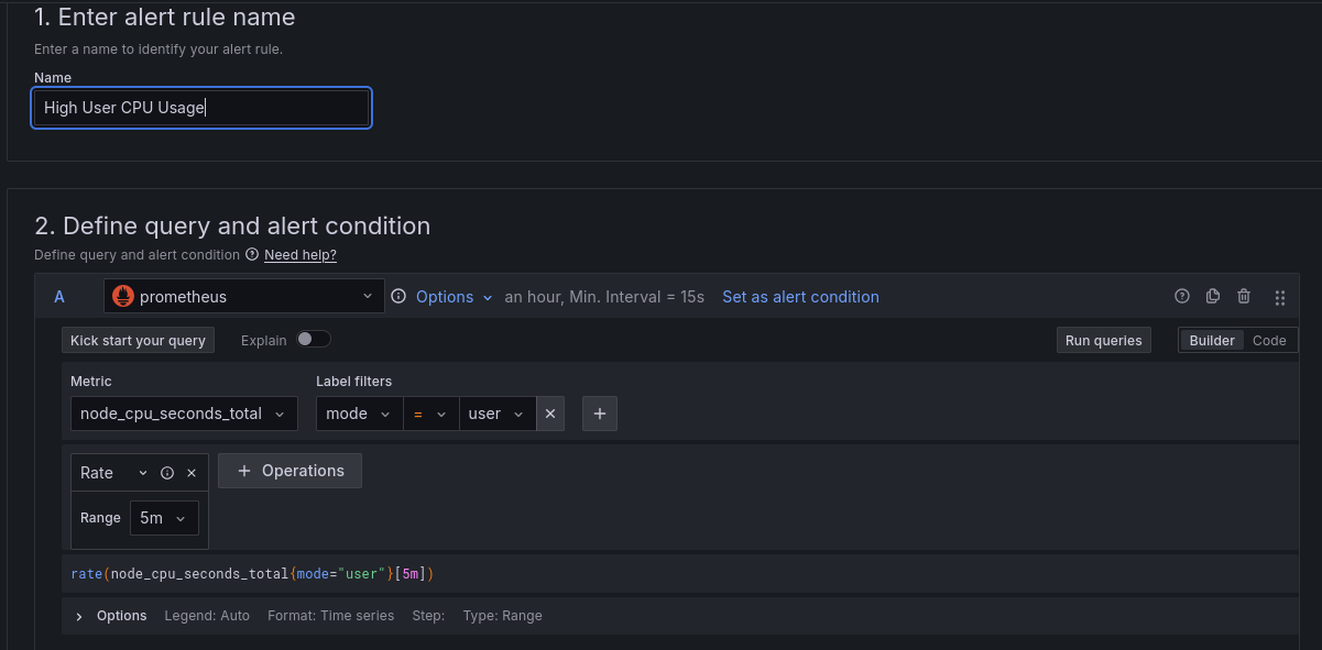
Set Up Alerts
Alerts in Grafana allow you to define conditions on your data that trigger notifications when met. These alerts help teams stay informed about critical metrics in real time, enabling faster response times and more efficient operations. Whether you're monitoring system health, business KPIs, or application performance, properly configured alerts can provide the peace of mind that you'll be notified before issues escalate.Define the Alert
Steps:1. Open your Grafana dashboard.
2. Navigate to the panel where you want to set the alert.
3. Click on the Alert tab and then click Create Alert Rule.
 |
| Click on the Alert tab |
4. Give your alert rule a descriptive name, such as High User CPU Usage Alert or Memory Utilization Breach.
 |
| Give your alert rule a descriptive name |
Define the Query and Alert Condition
The next step is defining the query that will pull data for the alert. Grafana uses PromQL (Prometheus Query Language) or other query languages depending on the data source.Steps:
1. In the Query section of the panel editor, enter your PromQL query. For example:
rate(node_cpu_seconds_total{mode="user"}[5m])
This query tracks CPU usage in user mode.
Rule Type
Grafana supports different rule types for alerts, which determine how conditions are evaluated. The most common rule type is the single-series condition, which checks whether a single time series meets the condition. You can also use multi-series or complex conditions for more advanced scenarios.Expressions
Grafana allows you to create expressions for more advanced alerting logic. Expressions allow you to apply mathematical operations or transformations to your data before applying the alert condition.Steps:
1. Click Add Expression to create a new mathematical expression.
2. Use functions like `avg()`, `sum()`, or `max()` to refine your data further before applying the alert condition.
`, `sum()`, or `max()` to refine your data") |
| Use functions like `avg()`, `sum()`, or `max()` to refine your data |
 |
| Combine expressions to create compound alert |
Set Evaluation Behavior
Setting evaluation behavior defines how often Grafana should check the alert conditions and for how long the condition must be true before triggering the alert. This ensures that short-lived spikes or noise don’t trigger unnecessary alerts.Steps:
1. Set the Evaluate Every field to define how frequently Grafana should evaluate the condition (e.g., every 1 minute).
2. Set the For field to determine how long the condition must be true before triggering the alert (e.g., for 5 minutes).
Example: Evaluate every 1 minute, and trigger an alert if the condition persists for 5 minutes.
 |
| Evaluate every 1 minute, and trigger an alert if the condition persists for 5 minutes |
Configure Labels and Notifications
Labels help categorize alerts, and notifications define where alerts are sent (e.g., email, Slack, PagerDuty).Steps:
1. Add Labels to categorize the alert (e.g., `severity=critical`, `team=backend`).
2. In the Notifications section, select where you want the alerts to be sent.
Set the notification preferences for Slack, email, Telegram or other integrations.
 |
| Set the notification preferences |
Add Annotations
Annotations provide additional context to alerts, such as displaying information on a graph when the alert condition is met. This can include alert summaries or descriptions.Steps:
1. In the Annotations section, add information that will be shown when the alert triggers (e.g., a message explaining the alert or a link to troubleshooting steps).
2. You can also customize how annotations appear on your dashboards.
 |
| customize how annotations appear |
Visualize the Data in Grafana
Grafana is a widely-used tool for data visualization that allows users to monitor and analyze data from multiple sources in real-time. Its flexibility in visualizing data makes it a preferred choice for users who want to gain deeper insights into their systems, applications, and business processes. Whether you’re working with Prometheus, MySQL, or Elasticsearch data sources, Grafana provides powerful visualization tools that can be tailored to meet your specific needs.Grafana is designed to help users visualize and interpret data easily. It offers a variety of panel types, such as Time Series, Bar Gauge, Gauge, and Heatmap, each suited to different data visualization needs. Whether you're tracking system performance metrics like CPU usage, or visualizing business metrics, Grafana's panels offer powerful ways to represent complex data in digestible formats.
Time Series vs Other Visualization Modes
Grafana offers multiple panel types to visualize data, each optimized for different kinds of metrics and datasets. Let's dive into some of the most popular visualization modes and their unique use cases.Time Series
The Time Series panel is one of the most commonly used visualization types in Grafana. It is perfect for displaying metrics that change over time, such as CPU usage, network traffic, or request counts. The data is plotted along a time axis, making it easy to track trends and spot anomalies.Advantages:
- Ideal for tracking trends and performance metrics over time.
- Can display multiple data points simultaneously, allowing for complex monitoring.
- Supports thresholds and dynamic updates, making it useful for real-time data visualization.
Monitoring CPU usage over time, visualizing memory consumption, or analyzing web traffic.
 |
| Monitoring CPU usage over time |
Bar Gauge
The Bar Gauge panel displays data in the form of bars, where each bar represents a data point or metric. This is useful for showing discrete values like resource usage, user counts, or sales figures.Advantages:
- Easy to interpret when tracking specific, discrete values.
- Can visually represent multiple values side by side.
- Great for snapshot views of system or business metrics.
Visualizing the number of active users on a website or resource usage (e.g., CPU and memory) on a server.
 |
| Visualizing the number of active users |
Gauge
The Gauge panel is great for visualizing single values like percentages or usage metrics. It’s most often used to display resource consumption (e.g., memory, CPU, disk space) in a dashboard.Advantages:
- Provides at-a-glance visibility of key metrics.
- Useful for showing capacity utilization.
- Supports thresholds, allowing you to color-code values based on predefined limits.
Displaying the percentage of memory or CPU used, with thresholds indicating acceptable versus critical levels.
 |
| Displaying the percentage of memory |
 |
| Displaying the percentage of CPU |
Heatmap
The Heatmap visualization is designed for displaying density or frequency data across two axes. It’s particularly useful for visualizing data distribution or identifying patterns over time.Advantages:
- Visualizes large datasets and patterns.
- Excellent for identifying trends, bottlenecks, or hotspots in data over time.
- Useful for anomaly detection or visualizing request latency distribution.
Visualizing request distribution, memory usage over time, or latency spikes.
 |
| Visualizing request distribution |
 |
| Visualizing request distribution with Heatmap |
Using Thresholds in Grafana
Thresholds in Grafana help you identify when a metric moves beyond a certain value, indicating that a condition (such as a high CPU load) has been met. Grafana allows you to configure thresholds on any graph to highlight important changes.- Visual Indicators: You can set thresholds to change the color of a graph or gauge when a certain metric reaches a critical value.
- Multiple Threshold Levels: You can define multiple thresholds for different ranges (e.g., green for "normal," yellow for "warning," and red for "critical").
Set a threshold for CPU usage: green (<50%), yellow (50-80%), red (>80%).
 |
| Set a threshold for CPU usage |
Graph Styles and Standard Options
Grafana offers a variety of graph styles and standard options to help customize the look and feel of your data visualizations. These can enhance the clarity of the data being presented and make dashboards more intuitive.Graph Style Customization
- Line Graph: Ideal for time series data, line graphs allow you to show continuous data points.
- Bar Graph: Useful for discrete or category-based data.
- Fill and Line Width: Adjust the transparency and width of lines for better visibility.
Standard Options
- Unit Formatting: Use built-in units such as percentages, bytes, or time to make data easier to interpret.
- Decimals: Control how many decimal points are displayed.
- Legend: Adjust the placement, visibility, and layout of legends to improve clarity.
 |
| Adjust the placement, visibility, and layout of legends |
References
Prometheus Documentation: The official documentation of Prometheus provides detailed insights into its architecture, setup, and usage. It’s a primary resource for understanding how Prometheus operates and how to use it effectively for monitoring.
Grafana Documentation: This guide from the Grafana website walks you through integrating Grafana with Prometheus to visualize metrics. It’s an essential resource for creating and managing dashboards with Grafana.
"Prometheus: Up & Running" by Brian Brazil: Published by O'Reilly Media, 2018. A comprehensive guide to understanding Prometheus from installation to advanced topics like PromQL and alerting. It’s a great resource for both beginners and advanced users.
Alertmanager Documentation: The official Alertmanager documentation, which covers how to configure and use Alertmanager for handling alerts generated by Prometheus.
Monitoring and Logging with Prometheus
Your Feedback Matters!
Have ideas or suggestions? Follow the blog and share your thoughts in the comments.
About Me
I am passionate about IT technologies. If you’re interested in learning more or staying updated with my latest articles, feel free to connect with me on:
Feel free to reach out through any of these platforms if you have any questions!
Comments
Post a Comment